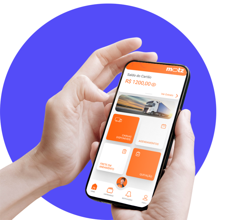
Motz - Product Design.
Votorantim – São Paulo / remote
UI Redesign and research for a digital platform that aggregates carriers, providing freight options for independent truck drivers.
Votorantim – São Paulo / remote
UI Redesign and research for a digital platform that aggregates carriers, providing freight options for independent truck drivers.
Role
Deadline
Team
Idealized by Votorantim Cimentos, Motz is an innovative digital platform aiming to revolutionize the freight transportation sector by connecting carriers with independent truck drivers. Its redesign aims to simplify the search and offering of freight services, ensuring an intuitive and efficient user experience. The focus remains on its target audience, which generally may not have extensive familiarity with technological concepts.
1.1 System Status Visibility:
Keep users informed about the status of their actions and the progress of processes.
1.2 System-World Realism Match:
Utilize language and icons familiar to the context of truck drivers and carriers.
1.3 Consistency and Standards:
Maintain a consistent structure throughout the application to reduce the learning curve, making options and functionalities easily recognizable.
1.4 Error Prevention:
Implement mechanisms to prevent common errors and provide clear feedback in case of issues.
1.5 Flexibility and Efficiency of Use:
Keep users informed about the status of their actions and the progress of processes.
1.6 Aesthetic and Minimalist Design:
Utilize language and icons familiar to the context of truck drivers and carriers.
1.7 Help Users Recognize, Diagnose, and Recover from Errors:
Provide clear error messages and guidance on how to correct issues.

2.1 Homepage
2.2 Truck Driver Profile:
2.3 Carrier Profile:
2.4 Freight Search:
2.5 Hiring Process:
The Motz Platform is designed to deliver an exceptional user experience, integrating the best practices of interface design and maintaining a focus on user satisfaction and efficiency. This strategic UI planning aims to create an intuitive, reliable, and aesthetically pleasing platform, fostering success for both independent truck drivers and carriers.
The success of Motz wouldn’t have been possible without comprehensive user research, focusing on understanding the needs and behaviors of independent truck drivers and carriers. Qualitative research played a crucial role in the interface development, providing valuable insights that decisively shaped the user experience.
3.1 Button Size:
The research revealed that truck drivers, for the most part, have larger fingers due to the nature of their work. This led to the decision to increase the size of buttons in the interface, ensuring they could be easily triggered even in less than ideal conditions.
3.2 Intuitive Navigation:
Users expressed the need for simple and intuitive navigation due to the dynamic nature of their profession. This influenced the organization of the interface to reduce the learning curve and make it user-friendly for those less familiar with technology.
3.3 Visual Feedback:
The importance of visual feedback was highlighted, especially during the process of searching and offering freights. Clear icons, indicative animations, and visual messages were incorporated to ensure users were always aware of the status of their actions.
3.4 Efficient Communication:
The research emphasized the importance of direct communication between truck drivers and carriers. This resulted in the implementation of an integrated instant messaging system, facilitating real-time communication and reducing potential misunderstandings.
Project Conclusion
Note: This is a summary of the project; some data and research have been omitted at the request of the company.